Little things that I've noticed:
Ups:
- Firefox seems faster.
Downs:
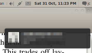
- the "notification area" is not at the top-right corner, but a bit below that, for no real reason. I've only noticed that for Pidgin notifications, and the area above the notification box is the size of the volume or brightness box.
- another major bummer is the middle-click function that used to work when i clicked on the top right corner of the trackpad. It doesn't work anymore, and there also seems to be a switch in the 2-finger click and 3-finger click functions, which i didn't know existed. The 3-finger click doesn't work on my 'top.
- the new Ubuntu Software Centre. I like the "installed software" section, but i miss being able to install/remove many apps at once.
- having "show icons in menus" unchecked in Appearance Preferences > Interface only removes the icons under the System menu. That's a grand total of 5 icons removed.
- boot time seems much longer, but it might be because it was the first time it was booted after the upgrade.
Undecided:
- Ubuntu is now shipped with a selection of still-life wallpapers, a great number of which feature close-ups of flowers. I hate to admit it, but at some point in my life, I would've gone "ooooooohhhhhh pwetty!" at the sight of it, but now it just seems horribly quaint and bland. To each his own, I guess. I rather liked it when Ubuntu came with 1 default wallpaper. Somehow, it was a symbol of the minimalism of the system. Now it just feels bloated.
There seems to be some typical wallpapers too, besides the close-up flowers: the pier to nowhere, sunrise/sunset, closeup of leaf, &c.
On the upside, I like that they've gotten rid of the fade-in transition when you changed wallpapers, and the black & white clouds pic is quite nice.
- i don't know what's up with the bold text, but I find it rather un-necessary. I figure I'll get used to that eventually. Also, the Firefox shortcut icon on my menu bar seems unusually bright. The blue highlight is paler, it seems, to the previous logo, and it looks like it's shining.

- at the other end of the menu bar, i quite like the icon for the network connection status, but not the one for the messaging services. The Human icon set had a white envelope that earned a green dot at a corner when there was an alert. The new Humanity envelope icon is gray with a dark gray triangle. Not very visible.

(note that the 2 last icons are transparent, and the menu bar is gray.)
Some changes in OpenOffice.org:
- hitting F11 for the Styles dialog will open the dialog, but will not focus it. Rather annoying, because I used to navigate the styles with the arrow keys, and now i have to focus it first.
- they seemed to have fixed that indentation "feature", where hitting backspace would remove the indentation. (Increase the indentation of the paragraph, hit enter. The next paragraph will also be indented. Hit Backspace once, it removes the indentation on the 2nd paragraph. Hit Backspace again, and it will remove the indentation of the previous paragraph, instead of bringing the caret to the indented beginning.)
- that place in the status bar that used to have an "*" signaling unsaved changed now shows a red "!".